
There is a moment, just before a feeling has a name, when it is still pure color and movement. Voxelized Emotions is my attempt to catch that moment and give it a body. Each piece in this voxel-art series takes a single emotional state and rebuilds it as a dense field of tiny three-dimensional units — voxels — so that mood becomes landscape, and feeling becomes something you could almost walk across. Working between code and composition, I treat each frame as a small terrain: a light source, a flow of texture, and a palette chosen the way a painter mixes for temperature rather than accuracy.
복셀라이즈드 이모션: 감정을 3D 복셀 지형으로 조각하다
감정에 이름이 붙기 직전, 그것이 아직 순수한 색과 움직임으로만 존재하는 순간이 있다. Voxelized Emotions는 바로 그 순간을 붙잡아 형태를 부여하려는 시도다. 이 복셀 아트(voxel art) 시리즈의 각 작품은 하나의 감정 상태를 골라 그것을 수많은 작은 3차원 단위—복셀(voxel)—의 빽빽한 장(場)으로 다시 쌓아 올린다. 그렇게 분위기는 풍경이 되고, 감정은 마치 그 위를 걸을 수 있을 것 같은 무언가가 된다. 코드와 구성 사이를 오가며, 나는 각 화면을 하나의 작은 지형처럼 다룬다. 빛의 원천, 질감의 흐름, 그리고 정확함보다는 온도를 위해 화가가 물감을 섞듯 고른 색채로.

When Color Becomes Relief
In Cosmos, sweeping contour ridges ripple across a deep field of violet, magenta and midnight blue, curving around a single bright point of light near the center. The layered bands read like the swirling arms of a nebula or the folds of a dune, drawing the eye inward toward that glowing core. What I love about the voxel approach is exactly this: color stops being a flat surface and becomes sculpted relief. The finely ridged texture turns hue into something tactile, so a piece about the scale of the universe can also feel like a thing you could hold.
색이 부조(浮彫)가 될 때
Cosmos에서는 굽이치는 등고선의 능선이 짙은 보라, 마젠타, 한밤의 푸른빛 위를 물결처럼 가로지르며, 중앙 가까이의 밝은 한 점을 휘감는다. 층층이 쌓인 띠들은 성운의 소용돌이치는 팔이나 모래언덕의 주름처럼 읽히며, 시선을 그 빛나는 중심으로 끌어당긴다. 내가 복셀 방식에서 가장 좋아하는 지점이 바로 이것이다. 색이 더 이상 납작한 표면이 아니라 조각된 부조가 된다는 것. 섬세하게 골이 진 질감은 색조를 만질 수 있는 무언가로 바꾸고, 그래서 우주의 스케일을 다룬 작품이 동시에 손에 쥘 수 있는 사물처럼 느껴진다.

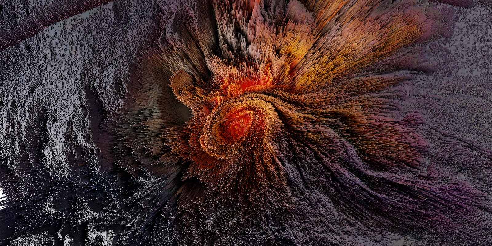
The Joyful Chaos of Bloom
If Cosmos is inward and mysterious, Bloom is its opposite — outward, celebratory, a little chaotic. Bursts of saturated pigment scatter across a dark ground in the full spectrum: crimson, cobalt, emerald, violet and white, like colored powder thrown into the air or petals exploding open. The black background lets every hue flare at full intensity, while the powdery texture keeps the bursts soft and weightless. It is the closest the series comes to pure delight — a frame that behaves like a single joyful explosion of growth and color.
블룸의 즐거운 혼돈
Cosmos가 내향적이고 신비롭다면, Bloom은 그 반대다. 외향적이고, 축제 같고, 조금은 혼란스럽다. 채도 높은 안료의 폭발이 어두운 바탕 위로 전 스펙트럼에 걸쳐 흩어진다. 진홍, 코발트, 에메랄드, 보라, 그리고 흰색이 공중에 흩뿌려진 색가루나 활짝 터지는 꽃잎처럼 퍼져 나간다. 검은 배경은 모든 색이 최대 강도로 타오르게 하고, 가루 같은 질감은 그 폭발을 부드럽고 무게 없는 상태로 유지한다. 이 시리즈에서 순수한 기쁨에 가장 가까이 다가간 작품이며, 한 화면이 성장과 색채의 즐거운 폭발 하나로 작동한다.

The Other End of the Spectrum: Burnout
A series about feeling cannot only collect the bright ones. Burnout is where the palette goes quiet and overworked — ashen greys bruised with dull ember and a tired wash of brown, the voxels packed so densely that the surface seems to sag under its own weight. Where Bloom throws its color into the air, Burnout lets it settle and flatten, as if the terrain has stopped reaching upward. I wanted the texture itself to read as depletion: not dramatic darkness, but the specific grey of having given everything and having nothing left to lift. Placing it beside the brighter pieces is the point. Joy is easy to sculpt; exhaustion is harder, because it has to feel heavy without becoming lifeless.
스펙트럼의 반대편: 번아웃
감정을 다루는 시리즈가 밝은 감정만 모을 수는 없다. Burnout은 팔레트가 조용하고 지쳐 가는 지점이다. 잿빛 회색이 흐린 잉걸불 빛과 탁한 갈색으로 멍든 채, 복셀들이 너무 빽빽하게 쌓여 표면이 제 무게에 주저앉는 듯 보인다. Bloom이 색을 공중으로 던져 올린다면, Burnout은 색이 가라앉아 납작해지도록 둔다. 마치 지형이 더 이상 위를 향해 뻗기를 멈춘 것처럼. 나는 질감 자체가 소진(消盡)으로 읽히기를 바랐다. 극적인 어둠이 아니라, 모든 것을 쏟아붓고 더는 들어 올릴 힘이 남지 않은 자리의 그 특정한 회색으로. 이 작품을 밝은 작품들 곁에 두는 데에 핵심이 있다. 기쁨을 조각하기는 쉽지만, 소진은 더 어렵다. 생기 없이 보이지 않으면서도 무겁게 느껴져야 하기 때문이다.

How a Feeling Becomes a Voxel Terrain
People often ask how a mood turns into a voxel field, and the honest answer is that I work backward from a single physical sensation. For Seafloor, it was pressure and slowness — the way sound dampens underwater — so the palette settled into deep teals and submerged blues, and the voxels grew rounded and smooth rather than sharp. Each piece begins with one decision like this, and everything else follows: the angle of the light, the direction the texture flows, the temperature of the color. The voxel becomes a unit of feeling rather than of space. Stacked by the thousand, those identical little cubes stop being a technique and start behaving like weather — something with a mood of its own that I’m only steering, not dictating.
감정이 복셀 지형이 되기까지
사람들은 종종 분위기가 어떻게 복셀의 장이 되는지를 묻는다. 솔직한 답은, 나는 하나의 신체적 감각에서 거꾸로 작업을 시작한다는 것이다. Seafloor의 경우 그것은 압력과 느림이었다. 물속에서 소리가 잦아드는 방식 말이다. 그래서 팔레트는 짙은 청록과 가라앉은 푸른빛으로 자리 잡았고, 복셀은 날카롭기보다 둥글고 매끄럽게 자라났다. 각 작품은 이런 하나의 결정에서 출발하고, 나머지는 모두 거기서 따라 나온다. 빛의 각도, 질감이 흐르는 방향, 색의 온도까지. 복셀은 공간의 단위가 아니라 감정의 단위가 된다. 수천 개씩 쌓이면, 그 똑같은 작은 정육면체들은 더 이상 기법이 아니라 날씨처럼 행동하기 시작한다. 제 나름의 분위기를 가진 무언가가 되어, 나는 그것을 지시하는 것이 아니라 그저 방향을 잡아 줄 뿐이다.

A Completed Voxel Terrain
It feels right that the series ends on Winter — a hushed field of pale blues and frost-greys where the voxels settle into a still, snow-quiet plain, the loud colors of Bloom and the heat of Burnout finally cooled into calm. Voxelized Emotions is now a closed series — twenty-one finished states, from Sunrise and Golden Hour to Beach, Daydream, Rust, Tundra and Winter, each one a small terrain of a single feeling. I’m calling it complete not because I ran out of emotions, but because the collection finally holds together as a single map: the bright and the depleted, the inward and the celebratory, all built from the same vocabulary of voxels. Seen side by side, the pieces stop being individual moods and become a kind of atlas — a way of standing back and looking at the whole emotional weather at once. The question that drove the project — how much of a feeling survives being translated into geometry? — finally has its answer in the body of work rather than in any single frame. Winter is a fitting last frame: with the terrain mapped and the season turned, I can move on to new ground, carrying what these voxels taught me about turning the formless into something you can almost walk across.
하나의 완성된 복셀 지형
시리즈가 Winter로 끝나는 것이 어쩐지 합당하게 느껴진다. 옅은 푸른빛과 서리 같은 회색이 깔린 고요한 장, 복셀들이 눈처럼 잦아든 정적의 평원이다. Bloom의 요란한 색과 Burnout의 열기가 마침내 차분하게 식어 내린 자리. Voxelized Emotions는 이제 마무리된 시리즈다. Sunrise와 Golden Hour부터 Beach, Daydream, Rust, Tundra, Winter까지, 스물한 점의 완성된 상태가 각각 하나의 감정으로 이루어진 작은 지형이다. 이 시리즈를 끝났다고 말하는 것은 감정이 바닥나서가 아니라, 마침내 컬렉션 전체가 하나의 지도처럼 맞물리기 때문이다. 밝은 것과 소진된 것, 내향적인 것과 축제 같은 것이 모두 같은 복셀의 어휘로 지어져 있다. 나란히 놓고 보면 작품들은 더 이상 개별적인 분위기가 아니라 일종의 지도책이 된다. 한 걸음 물러서서 감정의 날씨 전체를 한눈에 바라보는 방식 말이다. 이 프로젝트를 끌고 온 질문—감정은 기하학으로 번역되고도 얼마나 살아남는가?—은 이제 단 하나의 화면이 아니라 작업 전체 안에서 답을 찾는다. Winter는 마지막 화면으로 알맞다. 지형을 다 그렸고 계절도 돌아섰으니, 나는 새로운 땅으로 옮겨 갈 수 있다. 형태 없는 것을 마치 그 위를 걸을 수 있는 무언가로 바꾸는 법에 대해 이 복셀들이 가르쳐 준 것을 안고서.
🔗 junghyolee.com — Voxelized Emotions 컬렉션 전체 보기
Leave a Reply